What's the first step to solving any personal challenge? Knowing thyself.

Mindhack is a mental health self-awareness and goal setting app that helps people keep track of all their personal data in one place, so that they can more effectively manage their mental health, see trends over time, and set goals and expectations in a fun and easy way.

One day while using a mood tracking app,

I realized that my day-to-day perceptions of the past were significantly different than the actual recorded data. I was having a bad day, and felt like the whole month was going terribly. However on looking back at the month’s data, I realized that every prior day of the month had been recorded as “good” or “great” according to myself.

I realized that my current mood was altering my perception of reality.

And I wondered: what if there was an app specifically dedicated to tracking how closely one’s expectations actually matched with reality? What would be the result of someone placing “bets” on oneself? 

The Product: Executive Summary

Live prototype. Click me! 

Style guide & design system with 7 features and 12+ core components.

The brand voice is direct, focused, and optimistic, with visual themes inspired by gaming, the 80s, and city nightlife, using principles from Material Design, and Atomic Design, and Atlassian

Live prototype. Click me! 

And now for a live demo.

Finally, marketing:

Table of Contents

1. Research

Defining the problem and researching competitors

First, I conducted user research based on solving our problem statement, in order to gain the data and analysis needed to verify and justify that our core app features respond to existing user needs. The problem statement served as a starting point to determine more app details, business requirements, general design process objectives, and user stories. 

I then conducted competitive analysis research on Versusgame (a betting app) and Daylio (a Journal app), based on the concept of “placing bets” on oneself. I learned that there were no direct competitors in the market yet, which gave large potential for the unique selling point of the app.

What are people's biggest mental health needs and personal goals?

I conducted user surveys and interviews to find groups of user demographics within existing trends, user behaviors and motivators related to setting goals and expectations, and relevant app usage. I then conducted 5 interviews on goal setting and app usage, and visualized the results using empathy and affinity maps in Miro. 

Based on 18 survey results and 5 interviews, 0% of users selected “Betting” as an interest and were confused by word “bet” which they associated with gambling.

Solution:

I changed the word “bet” to “expectation,” and changed the app name from “uBet” to “Mindhack” to make the connection to psychology and mental health more clear.

Click to view:

I then conducted 5 interviews on goal setting and app usage, and visualized the results using empathy and affinity maps in Miro. 

Click to view:

Insights:

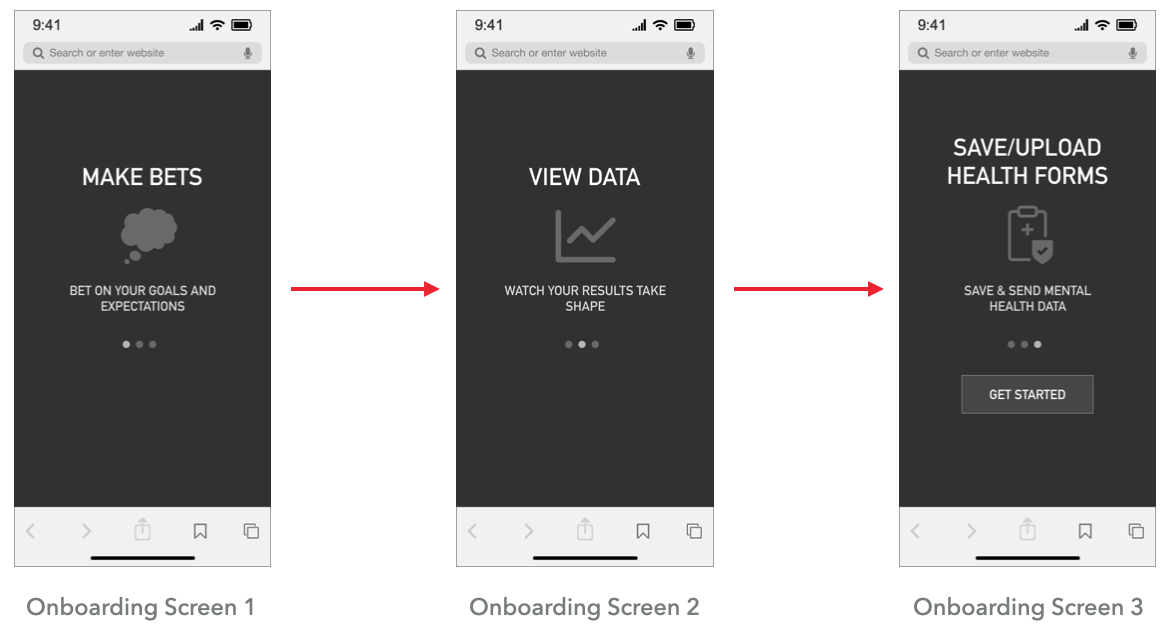
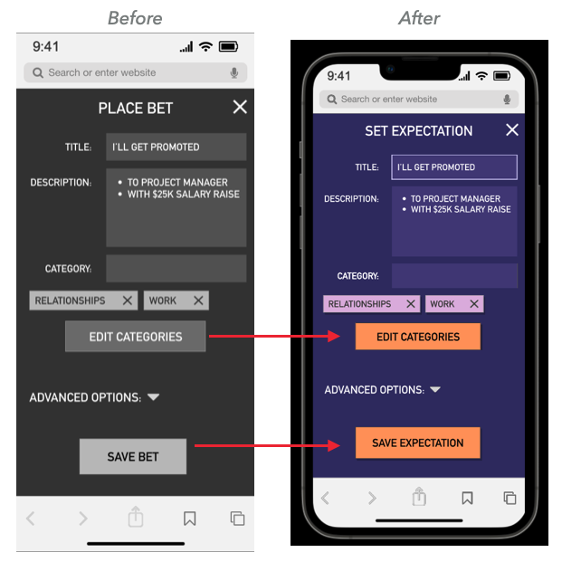
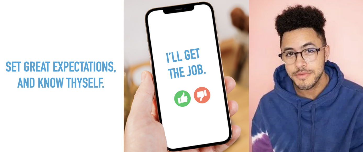
I found the easiest way to convey the app concept to new users was to mention “goal-setting” as a feature. The app then shifted towards being primarily a “mental health goal-setting app.” 

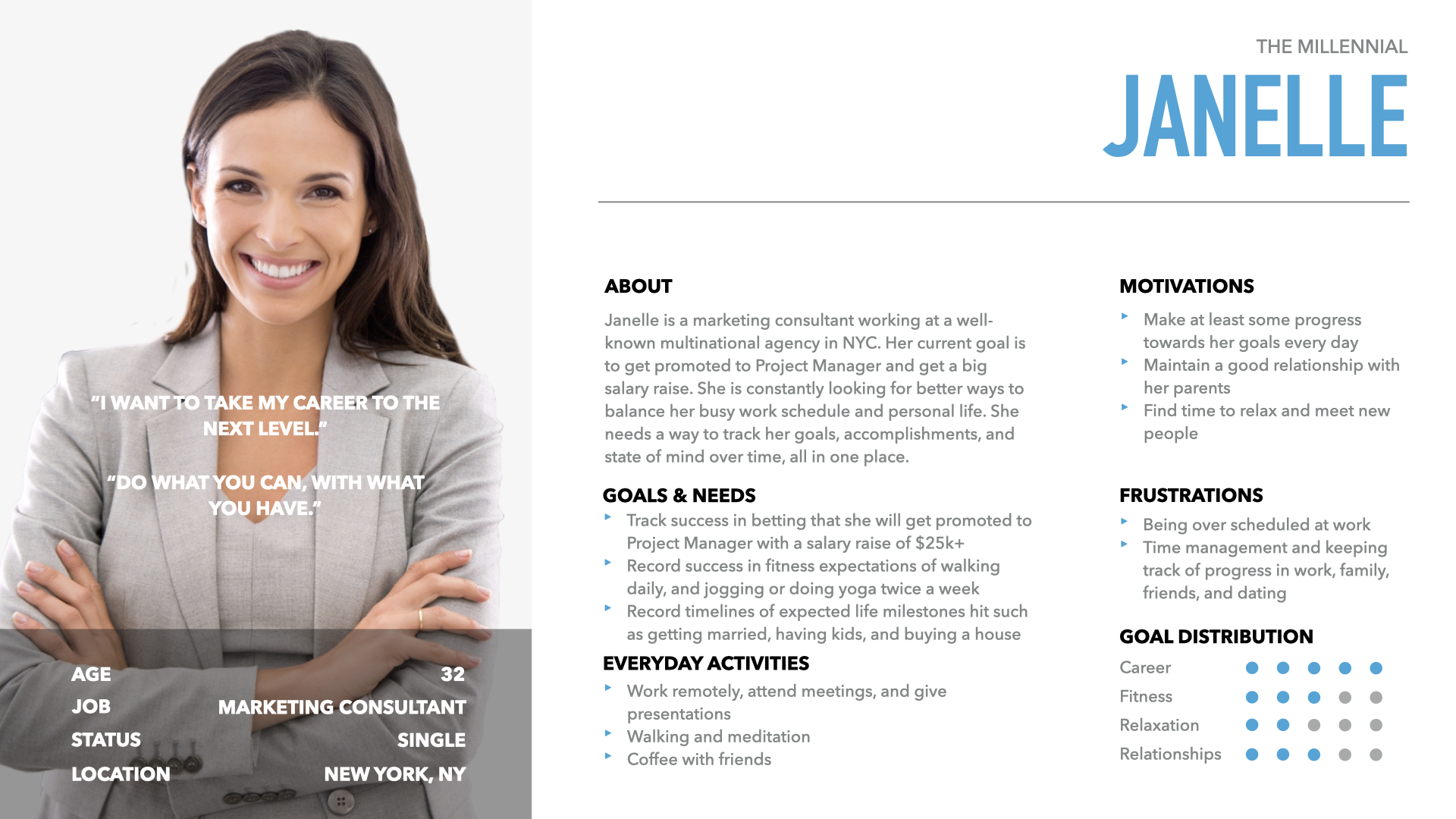
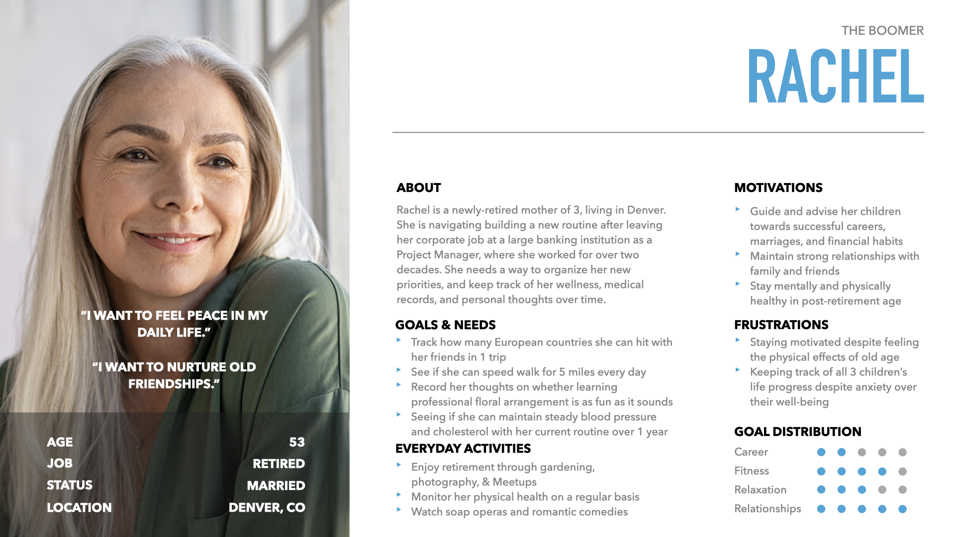
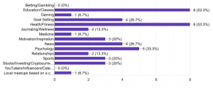
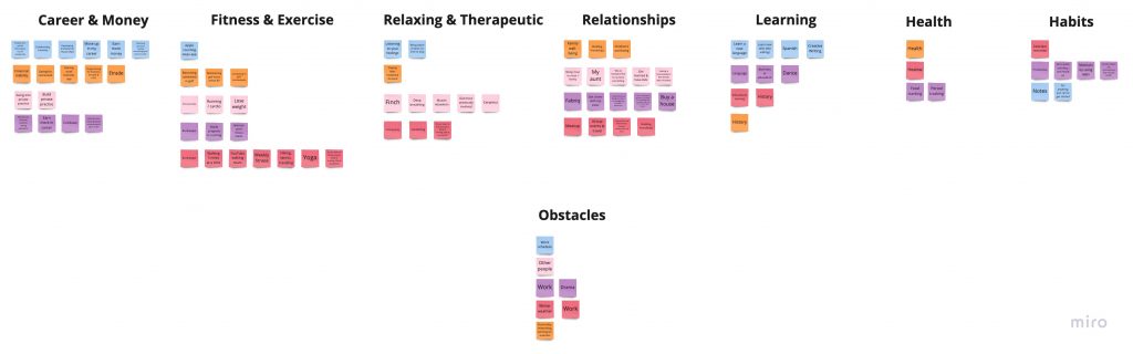
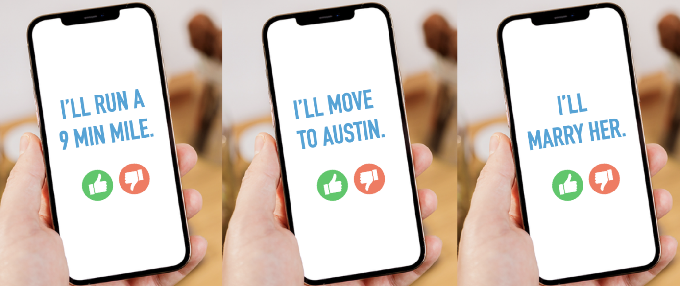
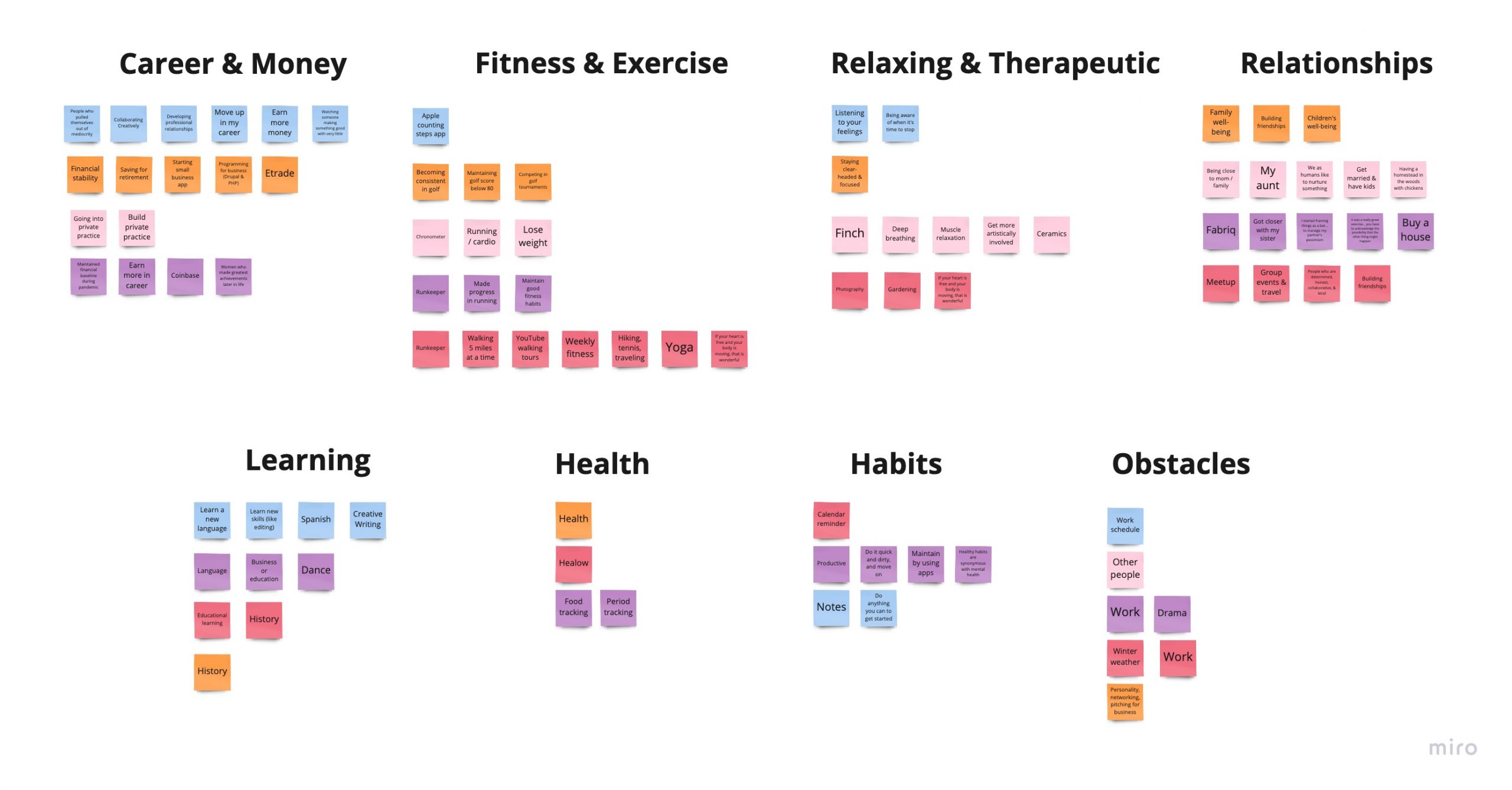
Commonly mentioned goals included making more money, building good fitness habits, developing self-awareness and mental focus, and building relationships, which I used to develop an ad campaign for the app. 

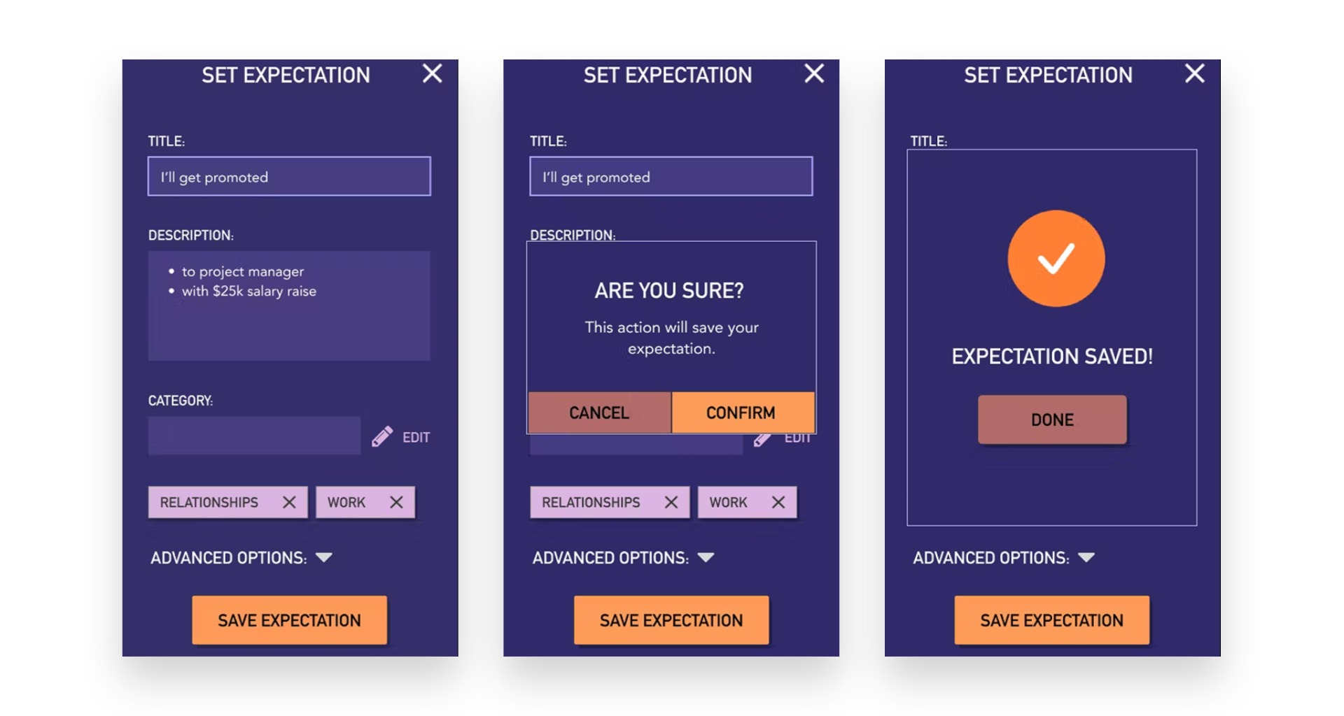
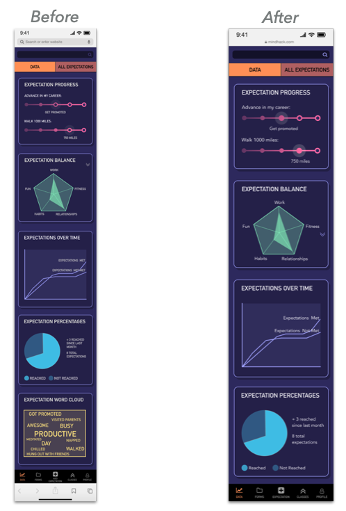
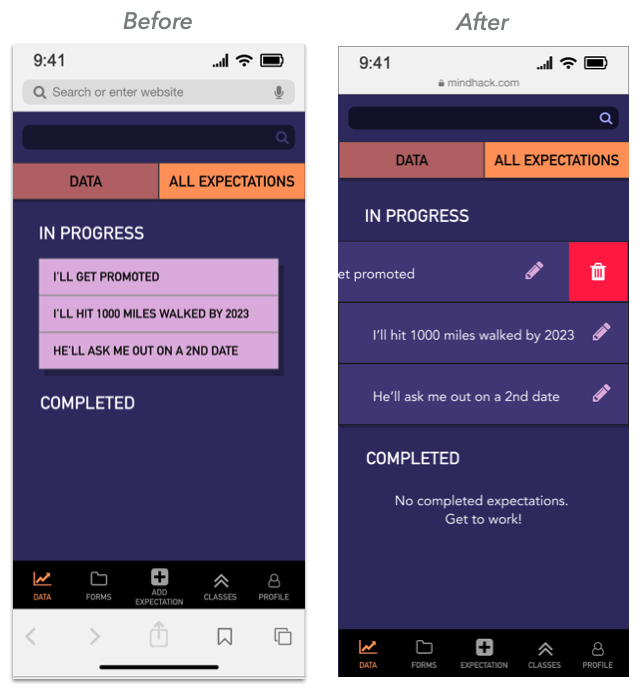
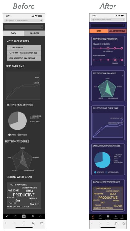
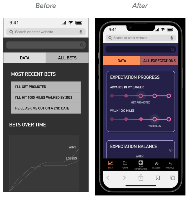
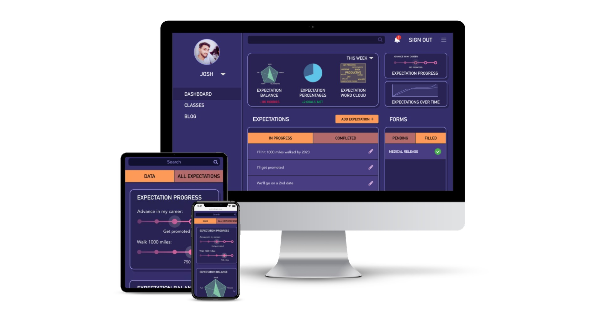
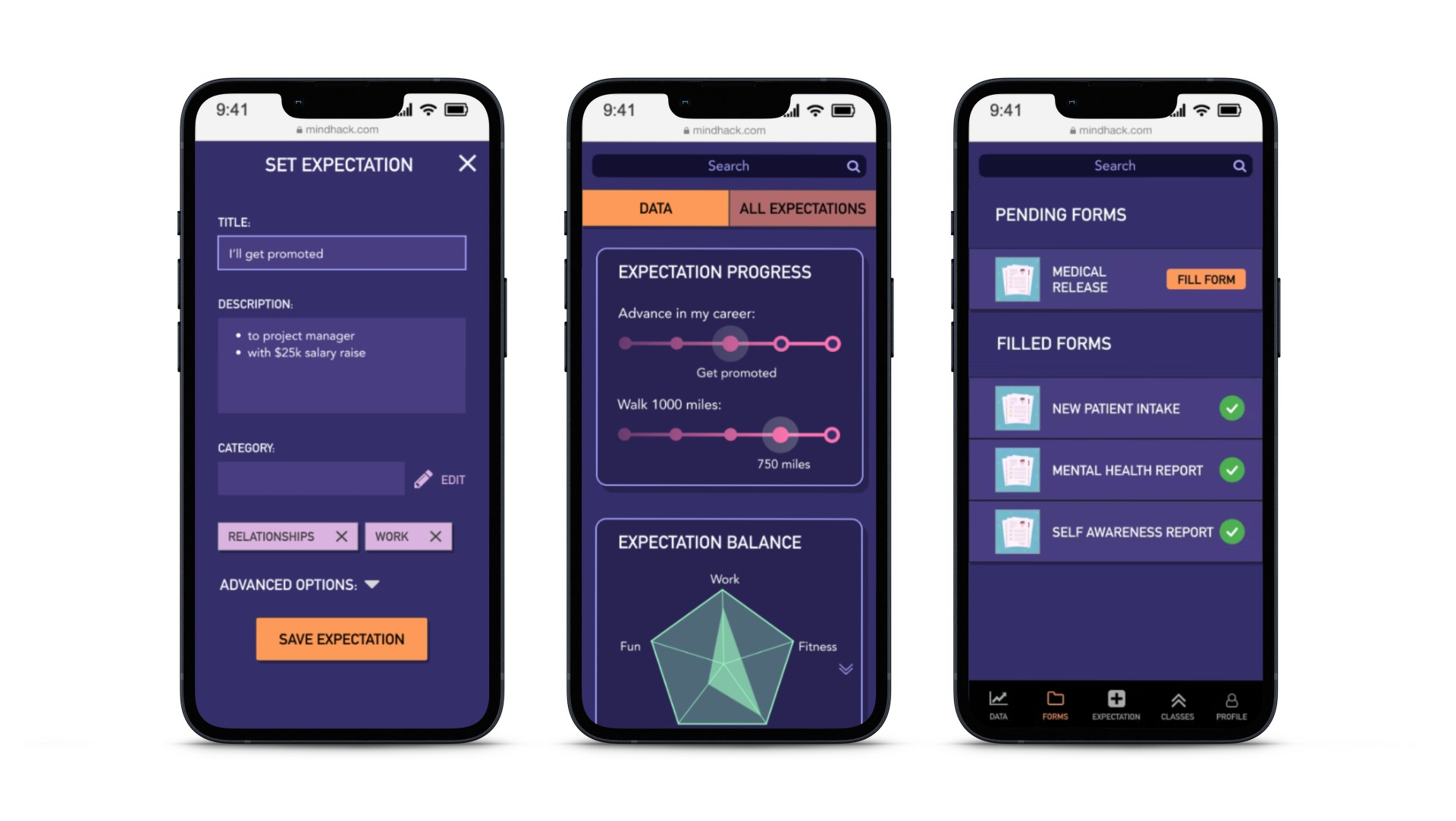
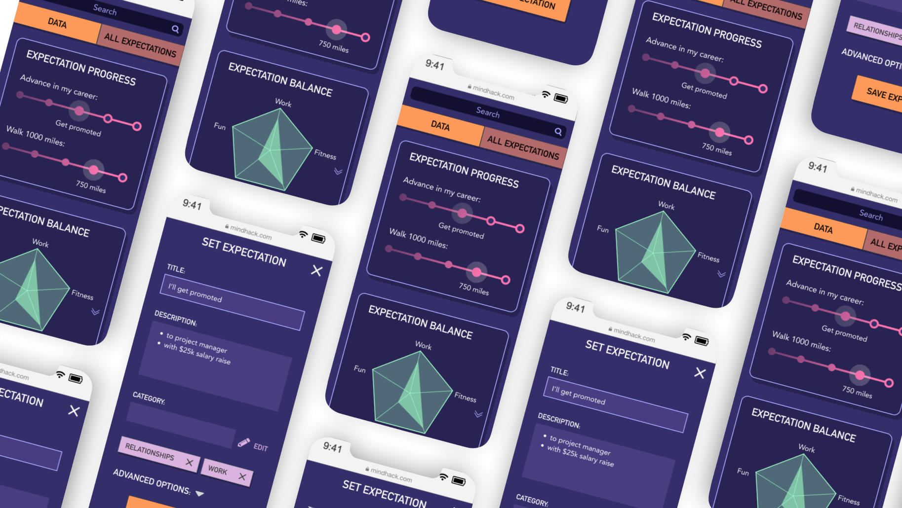
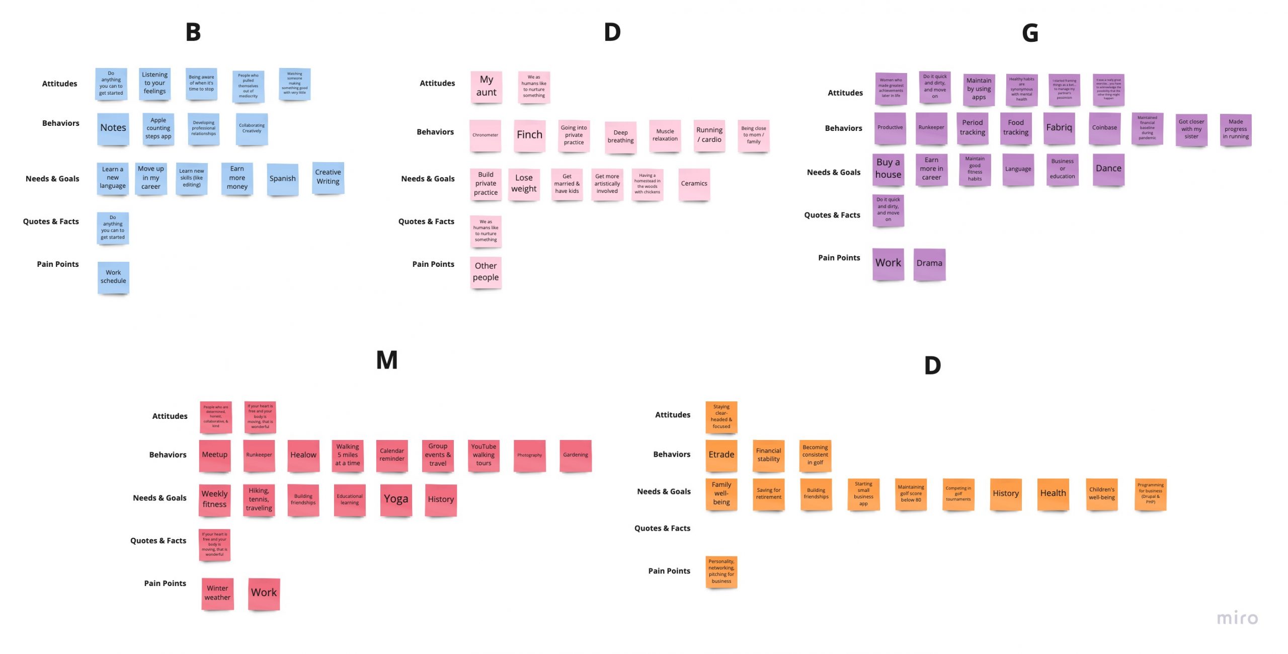
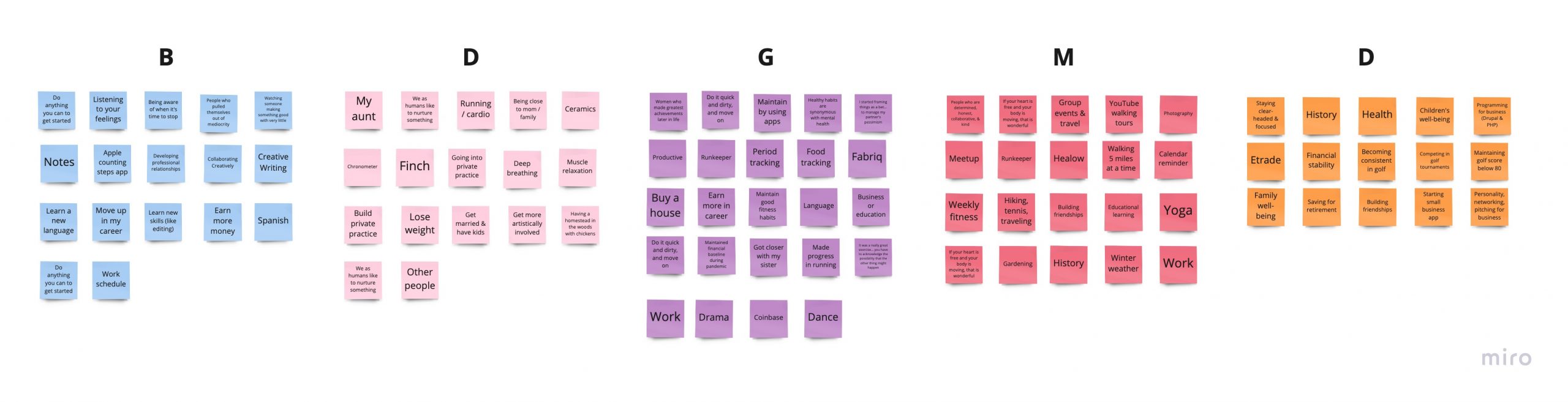
Participant responses suggest that good mental health is related to several factors, including professional achievement, personal fitness, good habits, and stable relationships, which I used for the app’s default goal categories

Who is our target demographic? Millennials and Boomers, of course!

All participants under 40 mentioned career advancement as their top goal, while all participants over 40 mentioned building friendships as their top goal. I used these age difference results to develop 2 main personas for the app, with the younger persona being more focused on career advancement, and the older persona being more interested in relationships and health.

I then mapped each persona to a user journey map of their favorite app feature. The user journey maps then served as the foundation for more detailed user flows of each task.

Next, I used the diagrams, logic, and higher-level objectives collected from user research to start building usable and relevant wireframes and prototypes.

2. Prototype

Going from sketches to high-quality mockups in 3 stages:

I designed and revised the app site map based on digital open card sort studies I conducted with 5 participants for about 15 minutes each, using the web app OptimalSort. Based on findings from the card sort studies, I made the page organization much more horizontal so that each screen was more accessible from the homepage.

I started by drawing pen & paper low-fidelity wireframes of core features of the app. I then created mid-fidelity wireframes in Sketch based on the paper wireframes. I imported the Sketch wireframes into Figma to add the final touches and create high-fidelity black & white wireframes. Finally, I connected the wireframes to create a fully clickable prototype

Wireframe evolution of the Set Expectation flow:

The most valuable skills I took away were how to efficiently use tools such as Figma’s component variants & properties, auto layout, and overlays, Apple templates, card sorting, and the principles of Atomic Design.

Next, I used the clickable prototype in usability tests with 5 users and revised the prototype based on user feedback.

Click to view:

3. Test & Reiterate

Is our app usable, accessible, and fun for real users?

Testing sessions were 15 minutes each, where I tested the core features of setting an expectation and saving a medical formI conducted recorded screencasts where I gave participants a scenario, instructed them to complete a task while verbalizing their thought process, and analyzed their actual behavior while using the app. I then facilitated A/B testing, and made a list of highest priority revisions to be made.

Issues Identified
0
of Issues Addressed
0 %
Test Sessions
0

I start to see design flaw patterns after interviewing about 5 people. I found the most effective way to fix confusion about the app’s purpose was to explain it as clearly as possible in introductory onboarding screens, and to make onboarding mandatory for all users. 

Top issues mentioned by users:

“lack of labeling” (60%)

“lack of onboarding” (80%)

“unclear wording” (40%)

“confusing home screen chart” (60%)

Solution:

I addressed these issues by adding clear labels to the Forms screen and Menu navigation, adding more descriptive onboarding screens, and conducting A/B testing to determine that the Progress Bar was one of the most preferred charts to view. 

Next, I took the analysis gathered from usability testing and used it to prioritize which revisions to make in the reiteration stage. 

Click to view:

Revising the design using 3 sources:

Example Revision: Set Expectation Screen

revisions set exp

Comments:

  • Having both Edit Categories button and Category field is confusing
  • Minimized and maximized screens are misaligned on the prototype
  • Add more breathing room between buttons because everything looks too cluttered

Revisions:

  • Made new Edit Category text input variant with Edit option
  • Fixed alignment on minimized and maximized screens
  • Added 30px margins in between text input field lists, 40px margins before first and after last form element, and 100px margin before bottom of the screen

In the final design stage, I made revisions from usability testing, updated the black-and-white high-fidelity wireframes to full color, and sent the prototype to fellow designers for peer review. 

The most frequent feedback was to fix the text input field formatting, and clarify button language and functionality.

Solution:

I received 25 comments from 4 peer reviews, and made revisions and updates to 7+ screens, modals, and popups, based on the peer review notes, as well as principles from Gestalt psychology and Material Design.

Click to view:

The finished product.

The finished prototype consisted of mobile and desktop screens, 7 features, and 4 types of data visualization

It was a thrilling process

to see my app go from idea, to wireframe, to fully-interactive prototype. 

My favorite part

of the design process was prototyping the app and the design system, because they involved the most visual creativity and component building. 

I gained proficiency

 in several skills, including Figma, Sketch, Axure, Miro, and Elementor, and developed a well-rounded experience of the user experience design process from beginning to end.

Design Thinking Process

Concept

I would like to design a gamified mental health app that uses betting to collect data on users’ expectations vs reality relating to mental health, thoughts, feelings, opinions, relationships, etc. Players can bet against their own expectations, or that of their friends, and the app will collect and analyze information using several forms of data visualization. The app will allow users to upload medical forms and input mental health data through a Profile feature, and will also provide mental health resources through a Learn More feature.

The goal of the app is based on the 12-Step recovery principle that increasing self-awareness of one’s own behavior over time is the foundation of mental health, wellness, and any type of behavior modification or addiction recovery.

1. Understand

I will perform competitive analysis on at least 3 existing analogous apps in the market (using concepts from Versusgame, Epocrates, and Remente), and create a problem statement based on the app I would like to design.

Questions:

  • What principles do similar apps emphasize the most (gamification, simplicity, binary decision making, etc)?
  • What are the most appealing UI features of similar apps?
  • What are the most effective ways of visualizing data for personal attitudes and decision-making over time and why?

2. Observe

I will conduct surveys and user interviews on 3-5 users of varying ages to refine and expand on the independent research I did in the Understanding stage, and to test the appeal and clarity of the app’s core objective.

Questions:

  • What age ranges and genders use mental health and betting apps most frequently, or do they have an appeal across age and gender groups?
  • Do different age ranges or genders tend to favor specific subjects when betting (sports, news, celebrities, stocks, etc)?
  • Are there any features users of existing betting apps wish they had? What are the gaps/opportunities in the market?

3. POV

I will create a primary persona based on the research gathered in the observe stage. I hope to summarize the age, gender, geographic location, occupation, user story, and higher objectives of the app’s target audience through this character.

Questions:

  • What are the background and goals of the primary user?
  • What is the main psychological payoff the user gains from playing a betting app or tracking their personal health data? (Ex: excitement to see the result, satisfaction or achievement from winning, gaining information or knowledge, short vs long term payoff?)
  • What is the main task he or she wishes to perform using the app? How can the task be gamified and made to feel as simple and fun as possible?

4. Ideate

I will create 3-5 task analyses and user flows from the objectives researched in the Observe and POV stages to cover the most important functionalities of the app. I might also try card sorting to determine the information architecture of the navigation, an organizational method I have not yet used in the course.

Questions: 

  • What are each of the screens required to encompass all features of the app? How to maintain game and betting elements throughout the app’s interactive components?
  • What is the information architecture of the navigation? How to make the navigation as minimal and simple as possible?
  • How to make the user flows feel as seamless and usable as possible?

5. Prototype

This will be the first stage where the visual form, game and betting themes, and unified branding of the app takes shape. Using the information collected from the Ideate stage, I will use Figma to design low to mid fidelity wireframes for each of the app screens, and then connect them together using appropriate interactions to make a fully-formed, clickable & interactive prototype of the app to be developed.

Questions:

  • What are the main color themes? Will it be dark like Versusgame (black, pink, turquoise) or will it be light like Epocrates and Remente (white and mint green / light blue)? Will the tone be bold and aggressive like a sports app or friendly and easygoing like a journaling or wellness app?
  • How to make wireframes and the prototype efficiently using the least number of screens possible, using components in Figma?
  • How to incorporate every screen transition possible in the prototype to simulate the UX of the real app? (Ex: loading states, slide transitions, popups/modals, page scrolling, etc?)

6. Test

I will conduct 3-5 usability tests on test users, analyze the results, and incorporate revisions in subsequent reiterations. I will run the tests using a general script and 3-5 situational tasks. My goal is to use results from 5 users to cover 80% of the needed improvements. My main goal will be to identify elements of fun in the app, that engage users’ curiosity and creativity, since it is meant to be played as a game.

Questions: 

  • What are the best ways to engage user curiosity and creativity? (For example: onboarding by making a simple bet, or slides showing funny/interesting examples of different bets users could make)
  • What are the biggest pain points? What are areas of confusion that could be made more clear?
  • Is the purpose and usefulness of the app clear to the user?
  • What did users like the most?

7. Tell A Story

I will summarize the results of all previous stages in chronological order to demonstrate how and why I designed the app into its current form. The stages should show changes from initial to final versions of concept, branding, functionality, and feedback/effectiveness. I will use as many numbers and concrete quantifiers as possible to convey solutions effectively. The app should remain true to the gamified theme of the original concept, while also fulfilling project requirements of being a health/wellness-related app.

Questions: 

  • Do any app objectives conflict with each other, and what is the best solution given all the options? (For example: betting/gaming vs health objectives, gaming vs therapeutic aesthetic, UI efficiency vs accessibility, etc)
  • What are overarching themes and phrases to summarize each stage?
  • Am I using numbers, data, and quotes wherever possible to support my thesis?

8. Present

Building off of the Tell Story stage, I will make a final, polished presentation of my app to effectively convey its main purpose, utility, visual themes, and potential to all members of the production team, including PMs, marketing managers, executives, other designers, and especially developers.

Questions:

  • How to give a brief but effective presentation (less than 10 minutes) that encompasses the main points stated above?
  • How to leave developers with a clear understanding of the app, and an interest to play the game themselves, and a motivation to build a great app? (For example: providing a link to the Figma prototype and doing a live onboarding or demo)
  • What list of resources/documentation to provide for further reference? (For example: link to the prototype, style guide, etc)

App Details

What is the app?

  • I will design UBET, a gamified mental health app that uses betting to collect data on users’ expectations vs reality relating to mental health, thoughts, feelings, opinions, relationships, etc. The app will collect and analyze information using several forms of data visualization, which will motivate aid the user with behavioral self-tracking and modification over time through data visualization.
  • The goal of the app is based on the 12-Step recovery principle that increasing self-awareness of one’s own behavior over time is the foundation of mental health, wellness, and any type of behavior modification or addiction recovery.

Who are the users?

  • The app’s main target demographic is adults aged 18 and above, who are curious or interested in psychology or behavior, setting goals, health-conscious (specifically about mental health), seeks to modify their own habits and behaviors, or who enjoys using apps with a gamified format.

When will this app be used?

  • Goal setting & expectations (physical, professional, personal, relationship, etc)

Where will this app be used?

  • Home (personal goals)
  • Therapist appointment or support group (sharing data visualization over time)
  • Gym (physical goals)
  • Any location associated with setting goals, betting events, doctor’s appointments, related to mental health, or related to setting behavior expectations

Why this app? What are the main features?

  • Login and Signup screens
  • Home Screen
  • Menu (Home, Search, Bet, Notifications, Profile)
  • Medical form input feature
  • Education, learning, & training feature
  • Betting feature that includes betting, results, and summary/home screens
  • Data visualization that analyzes betting results (up to 5 types of graphs/charts) within betting 
feature

How will users use this app? (User Stories)

  • “As a user who wants to track and store their mental health data, I want to be able to upload medical form & record pdfs so that I can easily store and access all of my important medical files in one place.”
  • “As a user who wants to track their mental health data, I want a fun and gamified feature to place bets on my expectations and beliefs about my own mental health and lifestyle, so that I can gain insight and self-awareness into my own expectations vs reality within a fun and engaging format.”
  • “As a user who wants to track their mental health data, I want several types of data visualization and analysis of my mental health data in easy-to-read charts/ graphs, so that I can intuitively understand the information at a glance, and see any improvements or changes in this data over time.”

User Stories (Sorted by navigation tab)

Login/Sign-up:

  • Login and Signup flow

“As a new user who wants to track their mental health data, I want to create an account so that I can securely store and access my personal data.”

“As a returning user who wants to track their mental health data, I want to log in to my account so that I can securely store and access my personal data.”

“As a returning user who wants to track their mental health data, I want to save my login credentials so that I can be automatically logged in to my account instantly without having to manually type my username and password every time I start the app.”

Home:

  • Home Screen 

“As a user who wants to track their mental health data, I want to have a landing page with a short and clear summary of my data and account information so that I can keep track of the most important personal information at a glance.”

  • Data visualization that analyze betting results (up to 5 types of graphs/charts) within betting feature

“As a user who wants to track their mental health data, I want several types of data visualization and analysis of my mental health data in easy-to-read charts/graphs, so that I can intuitively understand the information at a glance, and see any improvements or changes in this data over time.” 

  • Menu (Home, Search, Bet, Notifications, Profile)

“As a user who wants to track their mental health data, I want to have minimalist and intuitive menu options so that I can navigate the app quickly and easily.”

Search:

  • Search screen that contains tab for education/training feature

“As a user who wants to learn more about mental health and how to improve my own mental health, I want a universal search feature, so that I can find all relevant keyword results across different features of the app (including tracked user data, education, training, bets made, and medical forms). 

  • Onboarding (visual) for education feature

“As a user who wants to learn more about mental health and how to improve my own mental health, I want to be able to view brief and intuitive onboarding instructions or visual cues for the education feature, so that I can quickly grasp the kind of information and resources available for education and learning.”

  • Education, learning, & training feature

“As a user who wants to learn more about mental health and how to improve my own mental health, I want an educational feature that provides facts, training, and classes related to the field of mental health so that I can learn useful information, improve my mental health and lifestyle, and connect with others who share similar interests.” 

  • Meditation classes, local meetups, or integration with meetup.com for local meetups within education feature

“As a user who wants to improve my own mental health and wellness, I want to be able to view classes/training and meetups within the education feature so that I can improve my mental health and lifestyle, and connect with others who share similar interests.”

Bet:

  • Onboarding (interactive) for betting feature

“As a user who wants to track their mental health data, I want a short and simple onboarding process for learning how to use the app’s betting feature, so that I can quickly understand the app’s functionality and start using it, with minimal effort or confusion.”

  • Betting feature that includes betting, results, and summary/home screens

“As a user who wants to track their mental health data, I want a fun and gamified feature to place bets on my expectations and beliefs about my own mental health and lifestyle, so that I can gain insight and self-awareness into my own expectations vs reality within a fun and engaging format.” 

Notifications:

  • Notifications screen that shows betting results and monthly/yearly reports

“As a user who wants to track their mental health data, I want a push notifications, so that I can be notified instantly of my bets and monthly data reports even when I’m not using the app or logged in to my phone.”

“As a user who wants to track their mental health data, I want a notifications feature that lists new and old messages, so that I can keep track of my betting results, monthly reports, and activity history all in one place.”

Profile:

  • Profile completion stages (up to 3) based on uploaded information

“As a user who wants to track their mental health data, I want short, easy, and optional stages to complete my profile, so that I can input the information at my own pace, and only fill in the minimum amount of personal data that I need to and feel comfortable with.”

  • Medical form upload pdf feature

“As a user who wants to track and store their mental health data, I want to be able to upload medical form & record pdfs so that I can easily store and access all of my important medical files in one place.”

  • Onboarding (interactive or visual) for upload medical form feature

“As a user who wants to track their mental health data, I want a quick and helpful onboarding experience so that I can learn how to upload my medical forms easily and without confusion.”

  • Medical form input feature

“As a user who wants to track their mental health data, I want a way to input standardized mental health data into the app directly, so that I have a way to save and access my basic health data even if I don’t have a scanner or pdf file already on my device.” 

Business Requirements Doc

Executive Summary

Our mental health tracker will be a responsive web app that collects and analyzes user data using a betting ui that compares user expectations vs reality, stores medical information, and provides resources for further learning. 

Target Audience

The app’s main target demographic is adults aged 18 and above, who are more likely to game, gamble, or bet and also track their personal health data than younger or senior groups. The mindset of our target user is someone who is curious or interested in psychology or behavior, setting goals, health-conscious (specifically about mental health), seeks to modify their own habits and behaviors, or who enjoys using apps with a gamified format. 

Competition

Since our app is a novel combination of 2 traditionally separate fields (health tracking and betting), there are no direct competitors. However, some related apps include Versusgame, a popular betting app, Epocrates, a medical information tracking app, and Daylio and Remente, which track mood and life balance. Our app will function as a combination of the main features of all of these apps. The main crux is that it will use betting to collect user data that will aid in behavior modification, goal setting, and improved mental health, as a result of user self-tracking via data visualization. 

Risk/Opportunity

The primary risk is that because the concept of the app is so new, users may not immediately understand the purpose or utility of it. This could be helped by a simple and effective marketing campaign, using branding, slogan, and aesthetic to convey the app’s purpose and function to someone only seeing a screenshot or logo, and an effective onboarding experience to demonstrate betting examples, results, and improvement over time. 

There is opportunity to take advantage of this gap in the market by creating onboarding examples from real test users, and using brand aesthetics from familiar brands such as Versusgame and Tesla, so that the app appears more relatable and familiar, but at the same time original and new. 

Conclusions

There is a huge opportunity in the market to test the appeal and usability of an app that combines mental health tracking with betting. The key will be clearly and effectively conveying the purpose and utility of the app to users, and providing simple and effective marketing, onboarding, and data visualization. 

S.M.A.R.T. Business Objectives

1. Build a responsive mental health tracking web app that effectively conveys its purpose and utility

Measured by: Initial user tests and market size. Delivered by: 3 months from project start date

2. Gain 1,000 new users within 3 months of launching

Measured by: Signup count within the first 90 days. Delivered by: 90 days after product launch

3. Push 2 major build updates based on user reviews and feedback by 3 months after product launch

Measured by: Version number on app settings page and benchmarking survey. Delivered by: 90 days from project launch date

Marketing Strategy

  • Gain sponsors and funding by presenting at a tech conference and reaching out to possible relevant sponsors beforehand, initiating first-round VC funding (pharmaceutical, medical, psychiatric, and game or sports betting related industries), posting on Y-Combinator
  • Generate revenue through app Premium features, which would include more in-depth data visualization packages
  • Attract users through social media outreach: ads on YouTube relevant videos, promoting ads on podcasts of influencers with relevant demographics, or pitching to colleges/universities to do partnerships with their Psych departments

Scope

  • The application: The product includes all design and engineering.
  • Up to 5 types of data visualization: The information will be analyzed using several different graphs and charts, including line chart, bar chart, pie chart, word cloud, and radar chart. 
  • Marketing plan: Strategy for acquiring users over the first 3 months, using tested and effective branding strategy that includes style guide & slogan. 
  • Focus groups: testing onboarding for betting, saving medical forms, and learning more features. 
  • Version updates: 2 new builds that incorporate user feedback within first 90 days after launch date.

Functional Requirements (sorted by navigation tab):

Login/Sign-up

  • Login and Signup flow

Home

  • Home Screen 
  • Menu (Home, Search, Bet, Notifications, Profile)
  • Data visualization that analyzes betting results (up to 5 types of graphs/charts) within betting feature

Search

  • Search screen that contains tab for education/training feature
  • Onboarding (visual) for education feature
  • Education, learning, & training feature
  • Meditation classes, local meetups, or integration with meetup.com for local meetups within education feature

Bet

  • Onboarding (interactive) for betting feature
  • Betting feature that includes betting, results, and summary/home screens

Notifications

  • Notifications screen that shows notifications about betting results and monthly/yearly reports

Profile

  • Profile completion stages (up to 3) based on uploaded information
  • Medical form upload pdf feature
  • Onboarding (interactive or visual) for upload medical form feature
  • Medical form input feature

High-Level Delivery Schedule

The schedule assumes that user research has been completed prior to the first week of work.

Weeks 1-2 

User stories and flow charts

Weeks 3-4 

High-fidelity user interface mockups

Weeks 5-6 

Finalize user interface design

Weeks 7-8

Usable application prototype

Initial user testing

Finalized user interface implemented with revisions from user testing

Weeks 9-10

Finalized version of app complete 

Final QA testing

Weeks 11-12

Application launched

Competitor Profile: Versusgame

Overview

Key Objectives

  • betting app, any topic, user created, win money
  • “Get paid for being right” (promo vid), simple concept, engaging ui
  • betting app for everybody (consumers & creators) and everything (from sports to celebs)
 

Overall Strategy

  • targeting young audience, gamers, people into crypto, celebs, trending topics
  • Marketed towards consumers and creators “directly monetize your audience”
 

Market Advantage

  • Has the cool factor, appeal to younger audience, fresh idea by vc founder and celeb backing, novel concept
  • New idea, no direct competitor for social media user-created betting

Marketing Profile

  • VC startup by John Vitti, launched in 2019 so super new, 7.9 mil users, 7m in funding 
  • Partners with DefJam recordings, featured in Forbes and Maxim magazine among others, funding from Kevin Hart
  • Instagram: 72k followers
  • YouTube: 247 subscribers (only 2 videos)
  • TikTok: 3.9k followers
  • Twitter: 434 followers, same posts from Facebook, user bets/questions
  • Facebook: 1.2k followers, posts are bets/questions
  • Blog: about.versusgame.com , random interviews, vc promos

SWOT Profile: Versusgame

Strengths

Weaknesses

  • Cool factor, unique & fun concept, not many competitors
  • Sponsor on podcasts/other media, name recognition, celeb/pop culture focus engages young people
  • High responsiveness: native app, web, and mobile web
  • Tons of UI and functionality bugs, some major
  • inconsistent messaging: saw several different slogans, not consistent (What’s your pick? It pays to play. Get paid for being right, knowledge is money)
  • Not enough variety of promoted bets (look the same each time for unauthenticated users)

Opportunities

Threats

  • Very social network focused, what if there was personal version to play against yourself? 
  • Categories are strongly based on external social media trends, what if categories could be discovered based on personalized user data
  • Any app with a better execution, ui, or bigger user base, as it is new and just establishing its users, and still working out a lot of bugs
  • Only major related betting apps are FanDuel, BetMGM, and DraftKings, all sports apps and therefore more limited demo (men) and topic range (sports)

UX Competitive Analysis: Versusgame

Usability 

  • Generally low usability that’s still clearly being worked out
  • limited options for unauthenticated users, navigates to login screen with no way to go back to main screen, NO Sign up option, only Login
  • Hard to find podcaster I listen to (searched universal search and he didn’t show up in any category, had to type # name to find it)
  • Volume is not working on my iPhone 7
  • Following has list of people I’m not following
  • No onboarding, though betting is fairly straightforward
  • Summary screens are confusing and could use onboarding
 

Layout

  • Design resembles standard social media structure with center add button
  • dark game theme, similar to Tesla
  • Familiar but navigation and screen organization is confusing (see navigation structure)
 

Navigation Structure

  • web nav is confusing, messages and wallet are hidden within notifications tab, not exactly related features but grouped to prevent too many categories in bottom nav
  • Follow feature is completely preset and no correlation to users you’re following, not sure if this is broken or just very confusingly presented
 

Compatibility

  • good approach to responsiveness, has layout specifically for web, native mobile, mobile web
  • However, serious functionality problems such as no sound for native web app, no ability to sign up other than web app first 
  • Works across all major browsers (Chrome, Firefox, Safari, Edge)
 

Differentiation

  • is a new idea that doesn’t have a direct competitor in the market
  • Appeals to young people and all topics
  • For my own app, also is a new untested idea with no direct market competitors
  • For my own app, Can open up the user base from traditional mental health / medical apps (older people, women) to younger people & men, teenagers, data-driven for more tech-savvy generation
 

Calls To Action (CTA)

  • have referral codes and promo codes, sponsor podcasts and engage in celeb culture
  • Every screen for unauthenticated users on mobile leads to login, no way to sign up, need to add this option, only exists on web
  • Betting (main feature) is fairly straightforward

Survey & Interview REsults

Research Goals

Find out…

  • What is are the most popular types of goals?
  • What are the strongest motivators and demotivators?
  • What are currently the most popular goal setting apps?
  • How does goal setting connect to mental health?
  • Are there any goal differences between people in their 30s and younger, versus people over 40?

Survey Questions:

  1. What general topics interest you the most?
  2. Do you use any of the following types of apps? How often do you use the selected apps?
  3. What types of goals are most important to you?
  4. Do you use a therapist or support group? If so, how often and for what purpose do you use a therapist or support group?
  5. What social media sites do you use regularly?
  6. What is your gender, age, zip code, and occupation?
  7. Were any of the questions on this survey confusing or needing clarification?

Survey Insights:

Based on 18 survey results, I dedicated specific interview questions to the most popular topics mentioned, in the section titled “App Usage.”

About 70% of respondents were female.

About 75% of respondents were under 40.

Most people used apps daily to weekly.

Top 3 topics of interest were Education, Health/Fitness, and Psychology.

Nobody selected “Betting” as an interest even though all other related topics were selected, which suggests I should change the app name to more relevant phrasing.

Top 3 types of apps used were Health/Fitness, Stock/Crypto, and Goal Setting.
Top 3 types of goals were Creative, Fitness, and Mental Health.

The most popular social media site used was Instagram.

Interview Questions:

Goal Setting

  1. What are 3 goals that are important to you to achieve personally?
  2. Do you have any role models or inspirational figures, groups, or communities that inspire you?
  3. What has been the best way you’ve found to stay committed to pursuing and achieving your goals? Have you used technology/apps to aid goal setting in any way?
  4. What have been your proudest achievements or goals recently or in the past year?
  5. Conversely, what have been the biggest obstacles to achieving personal goals? Have you found any effective solutions to these problems?
  6. Do you actively focus on maintaining mental health or wellness in your regular routine? If so what have been the most important resources or tools you’ve found to helping maintain personal mental health?


App Usage

  1. What apps do you think you use most often and why?
  2. Do you use meetup.com or attend local events based around a particular interest?
  3. Do you use any goal setting apps?
  4. Do you use any wellness or journaling apps?
  5. Do you use any medical apps?
  6. Do you already use betting, gambling, or investment apps?
  7. Follow up to #3-6: What are your favorite app features, what features do you wish were improved, and how often do you use the app?

Opinion 

  1. What are the first 3 companies that come to mind in any industry when you think of the word “cool”?
  2. If you won free credits to take any classes you wanted to, what subjects would they teach or instruct

Interview Insights:

  • The 2 most mentioned types of goals were fitness/weight, and financial goals.
  • The most used goal related apps were fitness tracking and habit tracking apps.
  • The most common proudest achievements were career or fitness related.
  • The most common obstacle to achieving personal goals was work schedule.
  • The most common methods for maintaining mental health were cultivating good habits that were also simple, such as awareness, breathing, and gardening.

Survey & Interview Questions

Survey

1. Age, Gender, Occupation, Location?

2. Do you use any of the following types of apps? If so which ones?

  • Health/Fitness
  • Medical
  • Game
  • Betting/Gambling
  • Stocks/Investment/Crypto
  • Goal setting
  • Wellness/Journaling
 

3. What subjects interest you the most? (Select up to 3)

  • Health/Wellness/Fitness
  • Medicine
  • Gaming
  • Gambling
  • Stocks/Investing/Crypto
  • Sports
  • News
  • Celebrities 
  • Relationships
  • Motivational/Inspirational
  • Psychology
  • Education/Classes
  • Local meetups/events based on a common interest
 

4. What types of goals are most important to you? (Select up to 3)

  • Professional
  • Personal/Emotional/Mental Health
  • Relationship/Family
  • Physical/Fitness
  • Social/Community
  • Artistic/Creative
  • Educational
 

5. What social media networks do you use regularly? (Check all that apply)

  • Instagram
  • Facebook
  • Twitter
  • LinkedIn
  • SnapChat
  • TikTok
  • Reddit
  • Meetup
 

6. Do you use a therapist or support group? 

  • Yes
  • No
  • Prefer not to answer

Interview

Goal Setting 

  1. If you’d like to share, what are 3 goals that are important to you to achieve personally? They can be short or long-term, on any subject. 
  2. Do you have any role models or inspirational figures, groups, or communities you’d like to share about that inspire you? If so who are they and what about them is inspirational to you? 
  3. What has been the best way you’ve found to stay committed to pursuing and achieving your goals? Have you used technology/apps to aid goal setting in any way? 
  4. What have been your proudest achievements or goals recently or in the past year?
  5. Conversely, what have been the biggest obstacles to achieving personal goals? Have you found any effective solutions to these problems? 
  6. Do you actively focus on maintaining mental health or wellness in your regular routine? If so what have been the most important resources or tools you’ve found to helping maintain personal mental health?
 

App Usage


  1. What apps do you think you use most often and why?
  2. Do you use meetup.com or attend local events based around a particular interest? If so what is the activity?
  3. Do you use any goal setting apps? If so what are your favorite features, and what features do you wish were improved? How often do you use the app?
  4. Do you use any wellness or journaling apps? If so what are your favorite features, and what features do you wish were improved? How often do you use the app?
  5. Do you use any medical apps? If so what are your favorite features, and what features do you wish were improved? How often do you use the app?
  6. Do you already use betting, gambling, or investment apps? If so what are your favorite features, and what features do you wish were improved? How often do you use the app?
 

Your opinion!

  1. What are the first 3 companies that come to mind in any industry when you think of the word “cool”? What about them is cool?
  2. If you won free credits to take any classes you wanted to, what subjects would they teach or instruct? (Choose up to 3)

Low-fidelity wireframes

Mobile & Desktop Feature Flows

Paper prototyping was a great way to learn how to rapidly convey an idea through paper and pencil sketches using basic shapes. The limitations of only using lines, rectangles, and ovals to represent app elements was actually an advantage in not getting bogged down by details too soon, and being able to quickly lay out multiple screens and general feature flows that would lay the groundwork for refining the details and specific functionality later on. I found that even though I sometimes disliked the vagueness of paper prototyping, the specifics of the design naturally became clearer as I reiterated over them in later stages with mid and high fidelity wireframes, and also found new functionalities that needed to be added (such as the option to save multiple images per each saved form, not just one). 

Mobile & Desktop Onboarding

Mid-fidelity wireframes

  • I used several of Nielsen’s usability heuristics as well as horizontal site mapping to reduce user cognitive load. 
  • I used minimalist design to only display the most basic functions, provide expandable accordion sections for advanced options, and break longer flows such as Save Form into tiny steps with only 2 choices per step. 
  • I used consistency & standards to maintain the same color scheme and button spacing across the app, to reinforce repetition between different screens with the same functions (such as the Cancel buttons always being on the left, and the Submit buttons always on the right). 
  • Familiarizing users with main features and functionality in onboarding also reinforced consistency. I used match between system and the real world by using language familiar to users in a casual setting, such as “I bet…” and arcade-inspired messages for the Win/Lose screens. 
  • I used results from open card sorting studies with 5 participants to organize the navigation to be much more horizontal, so that more features were accessible at any given time, and most features were only 2 levels deep at most. 
  • By using all of these methods, I worked to reduce cognitive load visually, functionally, and behaviorally across the app.

Sign Up & Log In

Onboarding

Slides that give users a quick overview of the 3 core features (placing a bet, data visualization, and saving/uploading medical forms).

Card Sorting

Method

  • I conducted digital open card sort studies with 5 participants for about 15 minutes each, using the web app OptimalSort.
  • The objective of these studies was to verify whether my sitemap model was as correct as possible in matching user expectations of navigational screen organization.
  • I then used the results of the tests to revise my sitemap navigation to be more accessible, informative, and logical.

Setup

Testers

Results

Most common dendrogram groups were “Forms,” “Education/Training,” “Account/Profile,” and “Bets.”

Search Screen had the highest grouping variance, suggesting that it should be displayed universally and not just within one particular feature.
Groupings that differed highly from current sitemap were pairing Bets and All Bets together (as opposed to separate features), and pairing Upgrade To Premium with the Sign Up / Login Screen (as opposed to within the Profile Screen), all other groupings were highly consistent across all testers.

Insights

  • Make Forms its own tab:
    Forms were always grouped together, not within the Profile tab. Since Forms is one of the main features of the app, giving it its own tab would also increase visibility and accessibility.
  • Make Education/Training its own tab:
    Education and training screens were always grouped together, not including the Search tab. Since Education/Training is one of the main features of the app, giving it its own tab would also increase visibility and accessibility.
  • Change Wellness Articles to Mental Health Blog:
    Converting Wellness Articles into a Mental Health Blog will give the content a more personal, approachable, and modern feel.
  • Remove Notifications tab:
    No one really prioritized Notifications into its own category, nor grouped it consistently. Since this will not be a social media focused app, notifications will not be as important, so the feature does not need to be a homepage option. Removing Notifications would also give more space for other more important features, such as Education & Training. The data displayed by the Notifications tab will still be mostly available through the All Bets screen.
  • Changes not made:
    I chose not to group together “Place Bet” with “All Bets”, and “Upgrade To Premium” with “Sign Up / Login.” The Place Bet feature is intended to be highlighted as its own feature, similar to how adding a journal entry is its own tab in Daylio separate from all entries, while All Bets will be grouped with the rest of the user’s collected data. I also want to keep the promotional aspect of the app as unobtrusive as possible, so am leaving it in the Profile settings tab, and may also add it to the Data Visualization tab to give the user more options to access more data analysis, similar to how Premium features are promoted in Daylio.
  • Benefits:
    These changes made the app much more accessible and informative, with more main features directly visible from the tab navigation, resulting in less clicks/presses needed to access any given screen.

Mindhack Usability Testing

Usability Test Plan

Introduction

Mindhack Moderated Remote Usability Test (Mobile)

Conducted by Jenny Hou

Last Updated: April 27, 2022

Background

Mindhack is an app for health-conscious urban professionals who need a way to keep track of all their mental health data in one place and visualize their personal data, so that they can more effectively manage their mental health, see trends over time, and make health goals, in a fun and easy way. 

Goal

The goal of this study is to test the learnability for new users interacting with a gamified mental health app for the first time on mobile. We would like to observe and measure if users understand the app, its value, and how to complete basic initial functions such as placing a bet and saving a medical form. 

Test Objectives

  • Determine whether participants understand the purpose of the app easily (a gamified mental health tracking app) and the value it provides
  • Observe how users expect to place a bet and save a medical form from the homepage, and if the navigation and organization of the app makes sense
 

Methodology

The study was held both at the participants’ homes when available and online when otherwise, and was conducted as moderated in-person and moderated remote tests. The test included a short briefing, task performance with the Mindhack mobile app prototype, and a debriefing. See attached Usability Test Report for results. 

Participants

The study tested 6 participants from the user research stage of the project, and some newly recruited participants via friend and family connections. They were screened for basic demographic information to make sure they fit with one of the 2 user personas (millennial and boomer) of Mindhack. 

Schedule

Usability tests took place during the month of June 2022 at the participants’ homes or online via zoom screen sharing. Sessions were scheduled between 6pm-8pm. 

Script

See attached Usability Test Script for a complete list of participant background questions, open-ended questions, and usability tasks. 

Usability Test Report

Test Report Introduction

The study was very helpful in identifying several errors of varying priority, using the least amount of people possible. After three people, there were clear repetitions in reported errors and pain points, which gave some assurance that we had identified most of the major initial design flaws. 

Usability Test Issues

See attached Usability Test Issues for list of 5 issues that were addressed, with suggested changes and evidence. 

A/B Preference Testing 

See attached A/B Preference Testing for test screens, results, which screen users preferred most, and user quotes. 

Conclusion

I used the five errors identified above to revise the existing prototype. The errors were chosen based on the frequency with which they occurred or that feedback was given by participants, and rated according to Jakob Nielsen’s severity rating scale. I prioritized making the high-priority revisions first, and used any additional time to add in medium and lower priority issues. Almost all issues identified in feedback were addressed. 

Usability Test Script

Introduction

Hello and thank you for choosing to participate in this usability testing session. My name is Jenny and I will be facilitating the session with you today. The goal of the session is the be low-key, open-ended, and a useful way for us to collect data on the usability of the app. This test in no way is evaluating your competence as a user, it is purely evaluating the usability of the app itself, and aims to find design flaws through any feedback or pain points the user may encounter. In other words, there are no “wrong” answers, and any personal observations about the experience of using the app is helpful to us. The testing session aims to be about 15 minutes, starting with background survey questions, then some open-ended app usage questions, and finally 2 tasks in the app itself I will ask you to complete.

I’d like to request that while completing the user tasks, you think out loud as much as possible, so that we may get the clearest view into the user thought process while navigating the app. To this point, is it okay with you that we record this session via Zoom? The recording will be kept for research purposes only and not shared or uploaded to any 3rd party. If at any point you are confused about a task or a feature of the app, please let me know and I will be happy to give hints on how to continue to complete the task. If at any point you would like to take a short break during the session, or would like to end the session early, please let me know as well and I will be happy to accommodate the request. 

Do you have any questions before we begin? 

Are you ready to continue? 

Great, let’s start the recording and begin the session. 

Personal Demographic Questions

  1. Please select your age range: 
    1. 0-19 yrs, 
    2. 20-29 yrs, 
    3. 30-39 yrs, 
    4. 40-49 yrs, 
    5. 50-59 yrs, 
    6. 60 and above
  2. What is your current occupation?
  3. Do you use any special equipment, such as a screen reader, with your computer or phone? If so, which devices and how often? 
 

Background Questions

Before we start the tasks I have a few short questions to get to know how you might use Mindhack: 

  1. Do you use apps for any goal setting, or medical purposes? If so which apps and for what purpose, and if no, why not? 
  2. Have you ever used apps to track progress of something over a period of time, such as weight, steps, stocks, etc? If so, what have you tracked? And if not, why? 
  3. Is there any goal setting or medical related task that you wish there was an app for? If so what would the task be? 
 

Open-Ended Questions

Thank you for your answers thus far. Now we would like to get your first impressions of the app. 

  1. Spend some time looking at the home screen. Without clicking anything, what are your first impressions? What do you like, what do you not like, and is there anything that immediately strikes you as odd or confusing? Please remember to think out loud as much as possible. 
  2. Now that you’ve seen the general look of the app, can you tell me what you think the purpose of the app is? 

Thank you. Now we will ask you to try out 2 tasks using the Mindhack app. 

Tasks

Now we will give you 2 scenarios and activities to complete. As you complete each activity please continue to think out lout as much as possible, and tell us what you’re thinking and feeling. 

  1. You are trying to advance in your career, and want to record an expectation that you can get promoted to Senior Project Manager at your current company, with a salary raise of $25k, within 6 months. 
  2. You want to see if you can maintain healthy nutrition over the course of the coming year. You’ve scheduled your annual physical with a new physician and have filled out your New Patient intake form on paper, but want to take a photo of it with your phone and save it into the app so that you can easily forward it to your doctor’s office before your first appointment. 
 

Wrap-Up

Okay, that is the end of the session. I will stop the recording now. Thank you for participating and helping us better understand how to improve the app. Before you go, do you have any other feedback or questions? 

Usability Test Issues

Affinity Maps:

I collected observation and feedback notes from participants that I sorted into affinity maps by participant.  

Rainbow Spreadsheet:

I then visualized the data on a spreadsheet by issue and number of times each issue came up, and used the numbers to rank issues by priority. I then chose the 5 highest priority issues to address in the upcoming revisions. 

Issue 1: Users could not tell the difference between the Save and Upload Form options, or thought the flow was too long & confusing [high severity]

Evidence:

  • 60% of users could not tell the functional difference between the save form and add form option
  • 40% of users felt the save form flow was confusing or too long
  • 20% of users mentioned she used a similar feature on the app Healow which was much “shorter and easier” to use, that just involved filling a form her doctor’s office had sent

Suggested change:

Reimplement the Save Form flow to accept sent forms from a doctor’s office.


Issue 2: Users did not understand that the bottom nav bar was for navigation, and/or thought the icons & navigation were confusing [high severity]

Evidence:

  • 40% of users clicked on the wrong tabs to complete their tasks because there were no labels
  • 60% of users kept trying to use the radial chart labels as navigation and didn’t notice the bottom nav bar
  • 40% of users explicitly suggested there should be nav bar labels

Suggested change:

Add labels to the bottom nav bar and make icons more prominent


Issue 3: Users felt there should be a more prominent option to split larger goals up into smaller goals or steps [high severity]

Evidence:

  • 80% of users mentioned they would like the ability to group larger goals into smaller ones and progress through them

Suggested change:

Make goal (expectation) grouping more prominent as a feature.


Issue 4: Users felt the wording of goal statuses was confusing when using “win/lose,” and “match/mismatch” [high severity]


Evidence:

  • 40% of users mentioned the word “bet” was confusing, so changed to “expectation”
  • 40% of users mentioned the goal statuses were confusing, including “win/loss”, and “match/mismatch”
  • 40% of users seemed open to expectation statuses of “met/not met” or “reached/not reached” as possible updates

Suggested change:

Change expectation statuses to “reached/not reached.”


Issue 5: Users were confused by the first chart displayed on the home page (word cloud, radial chart, line graph, or pie/bar chart) [high severity] 

Evidence: 

  • 60% of users kept trying to use the radial chart labels as navigation and didn’t notice the bottom nav bar
  • 40% of users were confused by seeing the Word Count chart displayed first
  • 20% of users suggested using a bar chart instead of pie chart to more clearly show goals reached vs not reached

Suggested change: 

Test which chart users prefer (between radial chart or line graph)

Usability Test Results

Methodology

  1. Conducted 5 usability tests with 5 participants for 15-20 minute sessions each.
  2. Sorted participant feedback into affinity maps of Errors, Observations, Negative Quotes, and Positive Quotes.
  3. Visualized data on a table with results sorted by color and frequency.
  4. Added follow-up tasks in response to feedback of changes to make to the existing prototype.

Affinity Mapping Notes

Errors

  • Save Form Flow: Users didn’t know the difference between Save and Upload forms.
  • Navigation: Users kept trying to use the radial chart as navigation instead of the bottom tab navigation bar, and did not understand the purpose of some navigation tabs.
  • Scrolling: Users did not find scrolling down on the Home Screen intuitive.
  • Misc: Users thought the language of “Bet” was confusing and did not associate it with goal setting or mental health.

Observations

  • “Bet” language: Users thought the language of “Bet” was confusing and did not associate it with goal setting or mental health.
  • Progressive goals: Users mentioned the desire to set smaller goals as part of achieving a larger goal.
  • App purpose: Users who did not go through onboarding did not understand the purpose of the app, and users who did go through onboarding understood the purpose of the app clearly.
  • Scrolling: Some users found scrolling down on the Home Screen intuitive, while others did not.
  • Misc: Users thought that colors could be brighter, characters could be added, and animation to the goal achieved screen.

Negative Quotes

  • Home Screen charts: Users thought the home screen charts were confusing, specifically the word count and the radial chart.
  • Save Form Flow: Users didn’t know the difference between Save and Upload forms, thought the flow was too long, and that fields should be preset.
  • “Bet” and “match” language: Users thought the language of “Bet” and “win/loss” as well as “match/not matched” was confusing and did not associate it with goal setting or mental health.
  • Information visibility: Users preferred more clearly labeled navigation menu items, as well as a summary on the goal achieved screen, and more clear connection to mental health.

Positive Quotes

  • Easy tasks: Users mentioned both tasks were easy to complete.
  • Usability: Users commented that they could see themselves using the app for personal goal setting, and that the app could make them “more present.”
  • Branding: Users mentioned they liked the appearance of the app logo, name, and UI, and that it would be useful for sales & marketing.

Rainbow Spreadsheet

Insights

Next, I will use the feedback collected to revise the prototype. Some high-priority updates include:

  • Reimplementing Save Forms flow to accept forms from a doctor’s office.
  • Adding labels to bottom navigation bar.
  • Making goal grouping more prominent as a feature.
  • Testing for best language of goals & expectations “met” or “reached”

A/B Preference Testing​

In order to address Issue #5 where users were confused by the first chart displayed on the home screen, I conducted a 1 question A/B preference test that explained the basic premise of the app, and asked which home screen design users preferred, between a line graph, radial chart, and a progress bar. 

Results:

The results were close, but most users preferred either the progress bar (45%) or the radial chart (45%). 12% users preferred the line graph.

Quotes:

When asked why they picked this screen, users said it was the “easiest to understand,” “simple,” and “intuitive.


Next Steps:

The results of the A/B test clearly showed users strongly preferred the radial chart and progress bar to the line graph. However, because I already had data indicating confusion over the purpose of the radial chart, I decided to update the Home Screen to the progress bar, since it is a simple and clear way to illustrate the potential functionality of the app’s goal setting features, while a user created goal is being achieved. 

Recruiting test subjects

Recruitment Plan:

  1. I will contact 6 participants from the previous user research phase.
  2. I plan to test 2 participants in person, and everyone else remotely via zoom screen share.
  3. Before starting the testing session, I will read participants the script or paraphrase it, which will contain information about what the study is about, how the data will be used, and that participation is completely voluntary.
  4. I will have participants sign an informed consent form before testing, and as stated above will include information about how the study will be used in the script.

Consent Form:

Please read and sign this form.

During this usability test I agree to participate in an online session using my computer via zoom recording. This study is a usability test of a gamified mental health goal-setting app. During the session I will be interviewed about the app, asked to find information or complete tasks using the app and asked to complete an online questionnaire about the experience. The data collected from the study will be directly used to optimize usability and accessibility in the app’s design in future iterations.

 
I understand and consent to the use and release of the recording by Jenny Hou. I understand that the information and recording are for research purposes only and that my name and image will not be used for any other purpose. I relinquish any rights to the recording and understand the recording may be copied and used by Jenny Hou without further permission.
I understand that participation is voluntary and I agree to immediately raise any concerns I might have.


If you have any questions after today, please contact Jenny Hou.
Please sign below to indicate that you have read and understand the information on this form and that any questions you might have about the session have been answered.

Date:_________
Please print your name: ____________________________________________________  
Please sign your name: ____________________________________________________  
Subject’s Signature or eSignature: <your name>              

Thank you!
We appreciate your participation.
Please return the signed document to jhou2012@gmail.com.  

Test: Remote         __/__/__

Recruitment Email:

SUBJECT LINE:  You are invited to participate in an app study!


Hello,
My name is Jenny Hou, and I’m running a usability study for a gamified mental-health goal-setting app currently in the design phase.  In an effort to improve this app, we’re looking for people who may be interested in trying it out and giving feedback after using it.


What will I be doing in a usability study?
You will be asked to do several short tasks using a prototype of the app. You will also be asked questions about your experience and perceptions of the app.
How long is a session? 
15-20 minutes.
When and where?
The study will be held [DAYS, DATES].   You will be asked to participate via recorded zoom session.  No traveling is required as this is a remote study that will be performed online. You may participate using your office or home computer.


Interested in participating? 
Please reply to this email with your contact information or text/call me at 484-686-8296. 
If you have any questions, please contact me at jhou2012@gmail.com.

Thank you for interest,
Jenny Hou

Confirmation Email:

SUBJECT LINE:  Confirmation: Your participation in our usability study


Dear [PARTICIPANT NAME]: 
Thank you for agreeing to participate to test the gamified mental health app Mindhack.  As I mentioned, you will be asked to try out the app and give us your thoughts about your experience. You won’t need to prepare anything before the session. 

 
You are scheduled to participate as follows:
DATE: [DAY, DATE]
TIME: [TIME]
PLACE: Your computer
In a few days, we will send a reminder with your session’s zoom link. 

 
As soon as possible, please do the following:
1. Verify you can use Zoom
The study uses Zoom screen-sharing software. This Web-based application allows the study facilitator to remotely see what is on your computer screen and record the screen as you navigate the app. 
Please verify that you can use Zoom and perform any necessary installations or updates before the study time.  If you have never used Zoom before, please contact me and we can schedule a time to try it out together before the session.
Tip: It’s best to use a hands free headset or your laptop speaker so that you can talk to the facilitator and browse the app at the same time.

2. Read the Consent Form (attached)

With your permission, the session will be recorded. You will be asked to verbally consent to video recording at the beginning of your session.  We will only use the recording to decide how to improve the app. Your name will not be used for any purpose beyond this session.


A few key reminders:
·       During the study, we will ask you to complete some tasks using the app. You’ll talk out loud as you work so the facilitator can follow along.
·       Please reserve a quiet space where you will not be disturbed or interrupted during our session.
Also, we have only one person scheduled at a time for these sessions so if you find that you cannot participate on your scheduled day, please contact me as soon as possible so I can reschedule your session.

 
Thanks again!
Jenny Hou

Reminder Email:

 SUBJECT LINE:  Reminder: App study tomorrow


Dear [PARTICIPANT NAME]: 
Thanks again for agreeing to help us in testing the gamified mental health app Mindhack.  Here’s a recap of the key information.  

DATE: [DAY, DATE]
TIME: [TIME]
PLACE: Your computer

 
At least 5 minutes before your scheduled session time, please do the following:
Click on this link to join the Zoom Meeting session:  [INSERT LINK]
·       Allow Zoom to run and install any software necessary to join the session.
·       Enter your name and email address.
·       If a password is required, enter the meeting password: [INSERT PASSWORD]
A few key reminders:
·       During the study, we will ask you to complete some tasks using the app. You’ll talk out loud as you work so the facilitator can follow along.
·       Please reserve a quiet space where you will not be disturbed or interrupted during our session.
Also, we have only one person scheduled at a time for these sessions so if you find that you cannot participate on your scheduled day, please contact me as soon as possible so I can reschedule your session.

 
Feel free to contact me with questions.  
Thanks again!


Jenny Hou

Peer Review

  • Received 25 comments from 4 peers, and gave reviews for 4 peer prototypes
  • Made revisions and updates for 100% of comments, in varying degrees
  • Updates were extensive and included 7+ screens, modals, & popups
  • Most frequent feedback was to fix the text input field formatting and alignment, and clarify button language and some button functionality
  • I also made further updates including reformatting top and bottom Safari nav bars to increase screen space, and standardizing all list items

Home Screen

Comments:

  • Emphasize progress bar circular glow more
  • Word cloud is confusing, maybe add tooltip
  • Increase contrast of search input field and magnifying glass

Revisions:

  • Increased progress bar circular glow from 10% to 25%
  • Removed word cloud
  • Made search input field background color darker and set icon color to neon purple

Set Expectation Screen

Comments:

  • Having both Edit Categories button and Category field is confusing
  • Minimized and maximized screens are misaligned on the prototype
  • Add more breathing room between buttons because everything looks too cluttered

Revisions:

  • Made new Edit Category text input variant with Edit option
  • Fixed alignment on minimized and maximized screens
  • Added 30px margins in between text input field lists, 40px margins before first and after last form element, and 100px margin before bottom of the screen

All Expectations Screen

Comments:

  • Add empty state for Completed Expectations
  • All 3 expectations link to the same description
  • Add in Menu button is redundant, can remove

Revisions:

  • Added empty state text for Completed Expectations
  • Updated Figma interaction to link only from the first expectation
  • Removed Add word from menu button and made icon same size as other menu items

Using Material Design

Buttons

  • Added black drop-shadow with opacity 25% to all buttons, tag labels, item groups, and top navigation tabs
  • This change was a subtle but important way to make the app look softer and more textural in appearance, across all screens.

Text Fields

  • Added colored outline stroke to text input fields to simulate focus
  • This change gave the form screens a more visceral and involved feel, because the stroke draws the user’s attention and acts as an implied call to action for the user to edit the form field.

Cards

  • Added Card backgrounds with border highlights to all Home Screen data visualization charts
  • Each card contains Title and Content, has a drop-shadow effect, border highlight, and 16px border radius
  • This change gave the Home Screen a much more retro tone, and helped more definitively organize the charts and visually separate them from each other.

Gestalt Psychology:

Definition

  • School of thought based on understanding the way our minds organize and process the word around us
  • The most useful principles I used were laws of grouping (Proximity, Similarity, Pragnanz)
  • The guidelines helped me maintain effective consistency, contrast, and spacing throughout the app

Law of Pragnanz

Primary & Secondary Buttons: Using consistent primary & secondary colors for confirming selection, and focused tabs, to indicate pattern of select or selected action

Law of Proximity

Home Screen Spacing: Doubling spacing between Home Screen data visualization charts, to help user visually group each section together by closeness

Law of Similarity

Heading & Description Size: Using larger heading font size across all screens to visually indicate sections